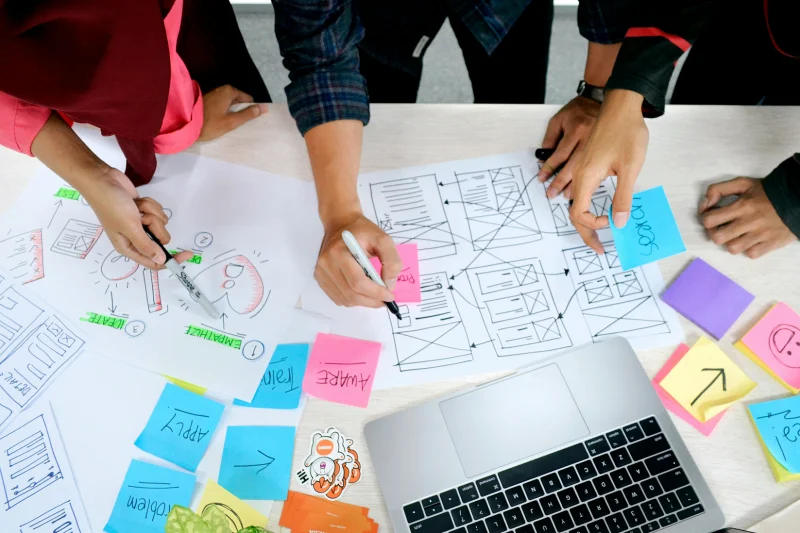
Why UX in B2B Systems Isn't "Nice to Have" but a Business Requirement
For years the common belief was that in business systems functionality matters more than ease of use. "Employees will learn," "this is a professional tool, not a toy": we've heard these arguments many times. Business reality tests them hard.
Measurable Costs of Poor UX
IBM research is often quoted as showing that every dollar invested in UX during system design returns $10 to $100 during use. The flip side is that poor UX brings concrete, measurable losses. Here are a few.
Implementation and training time. A system with an intuitive interface can go live in 2 to 3 weeks. The same functionality with complex UX takes 2 to 3 months to implement and needs continuous extra training. That is not only consultants' fees, but also employee time that could create value instead of going on learning the tool.
Errors and their consequences. Complex interfaces cause operational mistakes. In a warehouse system, poor UX can lead to inventory errors that produce excess orders or production shortages. In a CRM, wrongly entered customer data leads to failed campaigns and lost sales opportunities.
Adoption and workarounds. Gartner is quoted as finding that as many as 75% of B2B system users use only 20 to 30% of the available functionality. Not because the rest is useless, but because it is hard to find or use. Employees build their own spreadsheets, rely on memory instead of system data, or skip parts of the process.
ROI from Better UX: Concrete Numbers
The Nielsen Norman Group has documented that investing in UX when designing a B2B system can deliver:
50 to 60% less training time thanks to intuitive interfaces
30 to 40% fewer operational errors thanks to better user guidance
20 to 25% higher productivity thanks to optimised task paths
40% lower technical support costs thanks to fewer "how do I do this" questions
In practice, for an average company with 50 people working in an ERP or CRM, better UX can save $50,000 to $100,000 a year from higher productivity and fewer errors alone.
Fundamentals of Good UX in B2B Systems: How It Differs from Consumer Applications
Designing UX for B2B systems is a different discipline from building mobile apps or online shops. B2B users have different needs, work in different conditions and expect different things. Understanding that is the basis of good design.
Complexity vs Simplicity: Walking a Fine Line
B2B systems must handle complex business processes. An ERP joins finance, warehouse, production and sales. A CRM manages the whole customer lifecycle from lead to repeat purchase. Automation platforms connect dozens of systems and data sources. The complexity is necessary, but it doesn't have to be visible.
Progressive disclosure is a key principle. Instead of showing all 40 form fields at once, show the 5 to 7 most important ones and keep the rest in a "More options" section or later steps. Advanced users can go deeper and beginners aren't overwhelmed.
Sensible default values reduce the number of decisions. The system remembers user preferences, takes data from earlier operations and fills in fields based on context. Analyses suggest that every field the user has to fill in by hand raises the chance of abandoning the task by 3 to 5%.
Expert Users vs Beginners
In consumer apps we assume the user is a beginner. In B2B systems it is less simple. The same person can be an expert in one module and a beginner in another, and people with different experience and roles use the system at the same time.
Good B2B solutions offer an advanced and a simplified mode of the same function. A warehouse worker who has issued goods for 5 years needs quick keyboard shortcuts and as few clicks as possible. A new employee needs step-by-step guidance and checks at every stage. The system should adapt to the user's level.
Learning built into the system helps too. Instead of separate training materials, the best systems offer tips in context, a short tutorial the first time a function is used and example scenarios. People learn while they work, not before they start.
Work Context: Multitasking and Interruptions
Users of B2B systems rarely finish a task from start to end without interruption. A call from a client, an urgent question from a colleague, a production problem reported out of the blue: that is normal. So the UX has to allow for several things.
Automatic saving of state. Users must be able to stop a task at any moment and come back an hour or a day later without losing progress. Drafts, bookmarks and action history are not luxuries.
Quick switching of context. A good system lets you jump from an order form to a customer card, check stock levels, glance at the production schedule and return to the original task. Breadcrumbs, bookmarks and pinned views make this possible.
Several tasks at once. Consumer apps assume a linear path, but B2B systems must allow several processes in parallel. Open tabs, lists of tasks in progress and processing queues all have to be supported by the information architecture.
Practical Principles for Designing UX for Complex Processes
Theory is one thing. How do you actually design interfaces for complex business processes? These are principles we use in client projects.
Mapping Real Business Processes
The biggest mistake is designing a system from the technology side or from the database structure. The best B2B systems start from understanding how people really work, not how they should work in theory.
Before we write a line of code, we spend time with real users. We watch how a sales rep goes from first contact to a closed deal. We follow how a warehouse worker receives shipments and handles documents. We see how a financial controller closes the month. These observations show the real bottlenecks, the moments of decision and the points where departments have to work together.
We also remove steps that add no value. We often find steps that exist only because "it has always been done this way" or because of limits in an old system. Good UX design is a chance to question the status quo. Do we really need three levels of approval for orders under $250? Must data from an invoice be retyped into the system when we have OCR and integrations?
Consistency and Predictability
When users move between dozens of functions every day, consistency decides efficiency. If every module works a little differently, people have to relearn each time, which wastes time and causes errors.
Unified interaction patterns mean that filtering data looks and works the same in sales, the warehouse and finance. The "Save" button is always in the same place. Keyboard shortcuts are the same across the system. Navigation has the same structure.
A design system is not only about looks but mainly about operational efficiency. When users see a familiar component, they know at once how to use it. That lowers cognitive load and lets them focus on the task, not on the interface.
Validation and Error Prevention
In consumer systems, bad data is a small problem. In B2B systems it can mean financial losses, production delays and legal trouble. Validation therefore has to be proactive and smart.
Real-time validation tells users about a problem straight away, not after they have filled in the whole form and tried to save. A wrong tax ID format, an exceeded credit limit, unavailable stock: the system flags it as soon as the data is entered.
Prevention beats correction. Better than reporting an error is making it impossible. Drop-down lists instead of free text, automatic number formatting, blocking impossible combinations and suggestions from history all lower the risk.
Useful error messages don't just say "something went wrong." They say what, and how to fix it. For example: "Order value of $3,750 exceeds the customer's available credit limit ($2,500). You can: 1) reduce the order value, 2) get the sales manager's approval to raise the limit, 3) choose prepayment."
Personalization and Configurability
No two companies are the same, even in one industry. Processes, priorities and operations differ. A B2B system has to be flexible.
Configurable dashboards let each user build a view for their role and priorities. A sales manager sees the key metrics: pipeline, conversion rate, forecasts. A warehouse worker has critical stock levels, pending shipments and incoming deliveries on screen. A CEO sees the top-level KPIs for the whole organisation.
Customisable workflows mean the system can map the organisation's own processes. A manufacturer accepts orders differently from a distributor. E-commerce needs different order statuses than B2B wholesale. The system should support that without rebuilding the source code.
Roles and permissions that reflect the organisation. Not a rigid "admin, user, guest," but a flexible role system that matches the real structure and scope of responsibility. It also keeps the interface lean: users see only the functions and data relevant to their role.
Technologies and Solutions Supporting Better UX
Good UX is not only design but also the right technology. Modern B2B systems can use advanced solutions to be powerful and intuitive at once.
Intelligent Automation and AI
Artificial intelligence and machine learning are no longer science fiction. They are practical tools for improving the user experience in business systems.
Prediction and suggestions. A system that learns from user behaviour can suggest the most frequently chosen options, recommend products from order history and predict preferred delivery dates. Instead of searching a database of 10,000 products, users see the 10 most likely items with the first click.
Automatic form filling. Much data can be fetched from earlier transactions or external databases (government registers, VIES), or inferred from context. We add a new contractor and the system fetches the full name, address and registration data from the tax ID. We create an order for a regular customer and the system fills in delivery preferences, payment terms and the contact person.
Anomaly detection. AI can spot unusual patterns in real time and warn the user: an order ten times larger than usual, a shipment to a new unverified address, a transaction at an odd hour. The system can quietly suggest extra verification.
Integrations as the Key to Seamless UX
Users shouldn't have to switch between five systems to finish one business task. Integrations are not just a technical requirement. They are the base of a good user experience.
A single source of truth. Customer data should be entered once and be available automatically wherever it is needed: CRM, invoicing, warehouse, accounting. No retyping, no discrepancies, no "update system A first, then system B."
Data shown in context. Instead of opening a separate warehouse window to check stock, a well-integrated system shows availability right in the order form. Instead of switching to the finance system, the customer view in the CRM shows the account balance and payment history inline.
Automatic workflows between systems. You accept a quote in the CRM and an order is created in the ERP. The warehouse confirms shipment, the CRM updates the status, accounting issues an invoice and the mailing system notifies the customer. All in the background, with no manual steps.
Responsive and Multi-Device Accessibility
Remote and hybrid work is now standard. Managers decide from home, sales reps work on the road and warehouse staff use tablets on the floor. B2B systems have to work on different devices.
Mobile-first for selected functions. Not everything needs to be on mobile, as nobody will set up complex accounting rules on a phone. But some things are done mostly on the go: approving orders, reading sales reports, confirming deliveries, managing tasks. Design those mobile-first.
Progressive Web Apps. Instead of separate native apps, a PWA gives an app-like experience (home screen icon, offline mode, push notifications) without installing from an app store. One codebase, automatic updates, easier maintenance.
Offline capabilities. A sales rep in the field doesn't always have a stable connection. The system should allow offline work, such as saving orders and updating data, and sync automatically when the connection returns.
The Implementation Process: How to Move from the Old System to the New One Without Chaos
Even the best-designed system can be spoiled by a poor rollout. UX design doesn't end at the interface. It covers the whole migration experience.
Iterative Implementation vs Big Bang
The traditional way, switching off the old system on Friday and having everyone in the new one on Monday, is a recipe for trouble. Even the best UX needs time to get used to. People who have worked one way for years need room to learn.
A modular rollout introduces change gradually. Start with one department or one process, gather feedback, improve and only then expand. The calendar gets longer, but risk and cost drop sharply.
Running both systems in parallel during the transition gives users peace of mind. They know they can go back to the old system if something goes wrong. It is also a time to check that data migrates correctly and the new processes work as planned.
Pilot groups. Choose the team or division most ready for change and let it test the new system first. Collect their experience, make corrections and then let these "ambassadors" help roll it out in the rest of the organisation.
Training Tailored to Users
One universal "how to use the system" course for everyone wastes time and money. Different roles need different skills.
Role-based training. A warehouse worker doesn't need to know how to close the accounting month. A financial controller won't issue goods. We build training paths for specific positions, focused on the tasks that person actually does.
Just-in-time learning. Instead of five-day pre-launch sessions that will be forgotten anyway, we give short materials in context, when they are needed. A video tutorial appears the first time a function is used. A quick guide is one click from the interface. Knowledge is there when people need it.
Continuous learning. The system evolves, new features appear, processes change. Training is not a one-off event. It can be regular webinars on new capabilities, newsletters with tips and tricks, and an internal knowledge base the users build together.
Change Management: The Human Side of Transformation
Technology is only part of the equation. The real challenge is changing people's habits and mindset.
Explain "why," not just "how." Employees must understand not only how to use the new system but why it is being introduced. What problems does it solve? How will it make their work easier? What do they gain? Without that, change looks like needless complication from above.
Involve users early. The best ambassadors of change are people who feel like co-authors of the solution. At the design stage we involve key users from different departments. Their feedback shapes the system and, more importantly, they feel ownership and naturally promote the rollout in their teams.
Quick wins. People are sceptical of change, so show concrete benefits as early as you can. Look for the "low-hanging fruit": processes that are far simpler or faster in the new system. Early successes build momentum and win over sceptics.
How to Measure Success: KPIs for B2B System UX
Better UX is a business investment and should bring measurable results. Which metrics show that the system really works better?
Adoption Metrics
Percentage of active users. How many of the people with access use the system regularly? If it is not close to 100%, the system either doesn't meet needs or is too hard to use.
Frequency of key feature use. You built a reporting module, but users still make reports in Excel? Then the feature is not intuitive enough or doesn't fit their needs.
Time to competency. How long does it take a new employee to become productive in the system? In a well-designed B2B system it should be days, not weeks or months.
Efficiency Metrics
Task completion time. How long do typical operations take: creating an order, receiving goods, issuing an invoice, closing the month? A comparison before and after the new system should show a concrete speed-up.
Number of operational errors. How often per month must wrongly entered data be corrected? How many transactions are cancelled or changed because of mistakes? Good UX should cut these numbers sharply.
Process completion rate. How many started operations get finished? Do users drop complex forms halfway? A high drop-off rate points to UX problems.
Support and Satisfaction Metrics
Number of helpdesk tickets. Good UX should explain itself. If support is flooded with "how do I do X" and "where is Y" questions, the interface needs work.
User satisfaction scores. Regular surveys of users on satisfaction, perceived ease of use and willingness to recommend the system. Tools like Net Promoter Score (NPS) or Customer Effort Score (CES) can help.
Qualitative feedback. Numbers are one thing, but conversations with users show the nuances. What frustrates them? What makes work easier? Where do they see room for improvement? Regular feedback sessions are a valuable source of ideas for continuous improvement.
Summary: Simplicity in Complexity as a Competitive Advantage
A B2B system doesn't have to be hard to use just because it handles complex processes. The opposite is true: the more advanced the functionality, the more a well-thought-out UX matters. What limits a simple interface is not the technology but the lack of a user-centred design strategy.
Companies that treat the UX of their internal systems as a strategic priority get concrete business benefits:
lower operating costs through faster tasks and fewer errors
faster rollout and adoption of new tools, shortening the time to value of IT investments
higher employee satisfaction and lower turnover, which matters in a talent shortage
better data quality and better business decisions based on it
an edge that comes from the organisation's operational agility
Good UX is not a cost but an investment. It is not decoration but the base of effective digital transformation. As technology gets more accessible, the difference between companies lies less in whether they have IT systems and more in how well those systems help people reach business goals.
Time to Act: Build a System Tailored to Your Company
If you recognise the signals described here in your company, such as employees working around the system, rollouts lasting months and errors that cost money, it is time to change the approach. Technology can be your ally, not an obstacle.
Our team designs and builds B2B systems that are functionally strong and easy to use. We combine technical depth with experience in UX research and design. We don't sell off-the-shelf products. We build systems around your own business processes.
What can we do for you?
UX audit of existing systems, with concrete recommendations
Design of a custom CRM, ERP or automation system from scratch, with the emphasis on user experience
Modernisation of legacy systems: integration, interface improvements, process optimisation
AI and automation built sensibly into the workflow, not bolted on as separate tools
Step-by-step implementation with change management and tailored training
Contact us to talk about your organisation's challenges. We'll help you turn business goals into concrete IT solutions that your employees will want to use. The best systems are the ones whose operation users don't have to think about. They simply work.